There’s something subtly restorative about approaching a new year. It’s a time filled with hope, renewed intention and thoughtful expectations for the future. But a new year and a new decade? The effect can only be magnified. Which is why Dulux’s Colour of the Year 2020 is as perfect as the design world would hope.
0 items added to basket
Image currently unavailable
Price on enquiry
Subtotal (0 items)
£0.00
INSPIRATION
Dulux Colour of the Year 2020: Tranquil Dawn
There’s something subtly restorative about approaching a new year with Dulux’s Colour of the Year 2020.

By Jade Bloomfield, Editor
Intent on bringing us into the next ten years as gently and peacefully as possible, this year’s colour panel—which included colour designers, trend forecasters, design specialists, architects and editors from around the world—has chosen Tranquil Dawn.
A misty grey-green hue reminiscent of the morning’s earliest moments. It speaks to both new beginnings and an innate inner stillness—the colour expert’s take on what the world is hoping for in the upcoming 2020s and how to manage “new global trends that will affect us all."
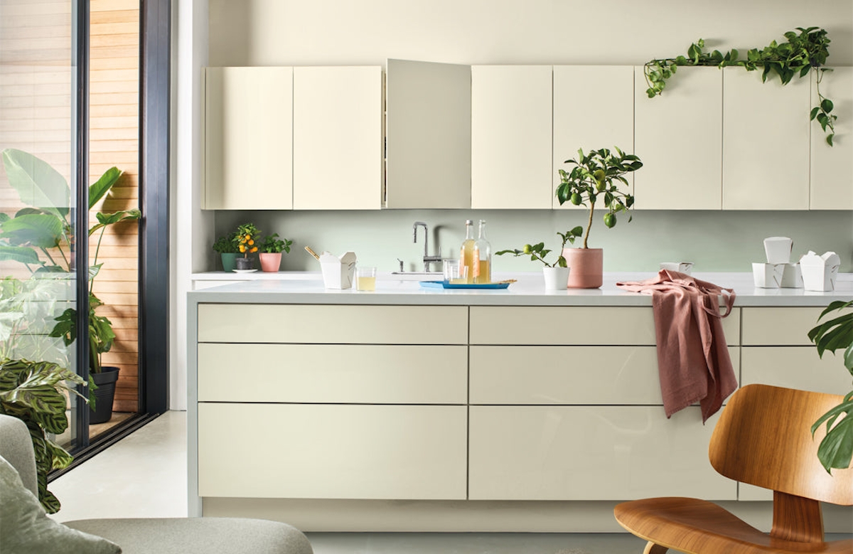
Image Credit: Dulux
“At the start of this new decade, the panel identified that the world has a growing desire to understand what makes us human,” revealed Heleen van Gent, Head of AkzoNobel’s Global Aesthetic Centre, about the selecting of Tranquil Dawn.
“Against a background of increasing technological power, we want to understand our place in society and how we can make a positive impact on it. We need a fresh purpose, to be the architects of our own future and we are asking searching questions of both ourselves and society.”
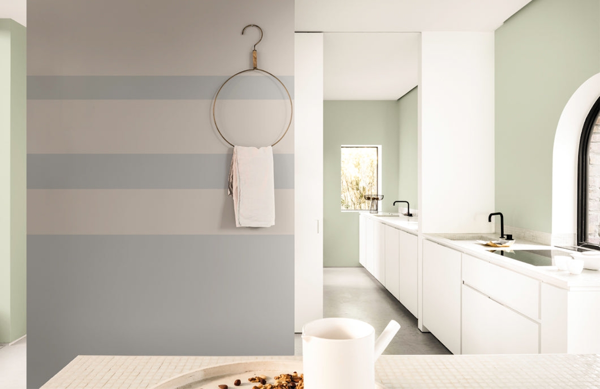
Image Credit: Dulux
So, does it deliver? Non-tech—yes; positive impact—of course; fresh purpose—absolutely. With its natural inspirations and base colour, Tranquil Dawn is almost the exact opposite of the unnatural world of technology. It is full of life yet calm in the way only nature can be. Its gentle light to medium intensity has the ability to relax the mind and body, allowing its viewers the opportunity to recharge before setting about to affect positive change. And what green-based hue isn’t the source of refreshed purpose? Look up “refreshed purpose” in the colour dictionary and it’s the obvious choice.
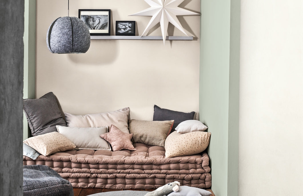
Image Credit: Dulux
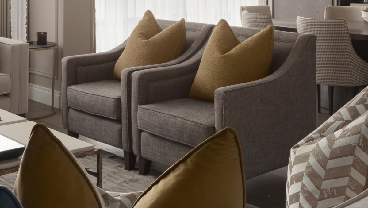
Marianne Shillingford, Creative Director for Dulux UK, says it this way: “A new decade heralds a new dawn and the hazy pale green tones of Tranquil Dawn™ are calming and comforting just when we need it most in our lives. When paired with neutral pastels and rich jewels it becomes incredibly powerful at creating spaces that encourage making better human connections.”
/products/chelsfieldtl_off1632042981019.jpg)
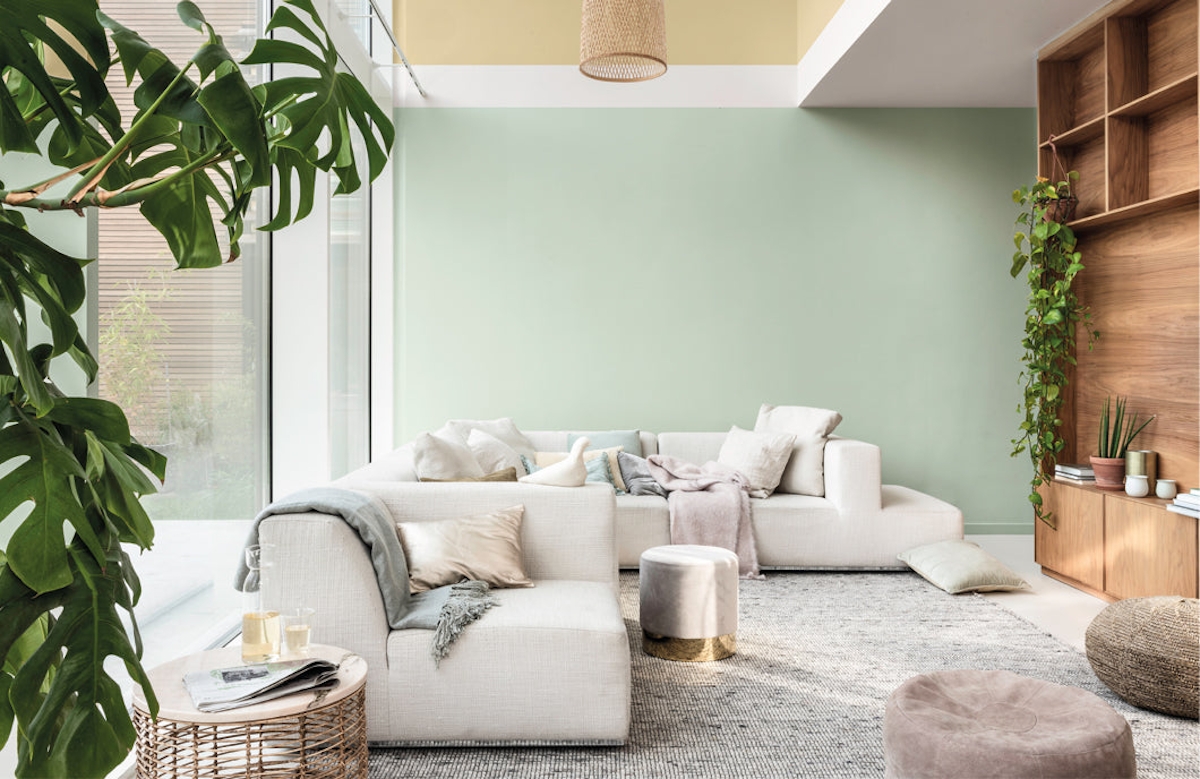
Image Credit: Dulux
2020 Dulux Colour Palettes
Speaking of pairing it with other tones, Tranquil Dawn isn’t the only colour the renowned forecaster has its eye on. In fact, each year Dulux suggests a plethora of hues to combine with its Colour of Year, allowing designers and creatives to use carefully researched, layered colour palettes to achieve different moods.
Last year’s Colour of the Year 2019 Spiced Honey, for example, was paired with rich burgundies and near-blacks for a thoughtful colour scheme; then, in an alternative scheme designed to inspire action, it acted as the neutral amongst an array of vibrant tones.
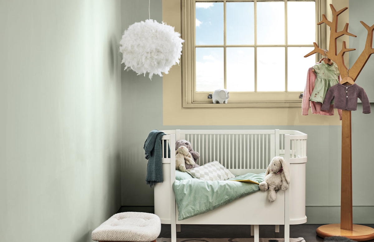
Image Credit: Dulux
This year, however, the theme was all about creating opportunities to experience the “human touch”—those moments that are perhaps becoming rarer and rarer as time and technology advances.
Four main colour palettes were identified by the panel as the means to experience these human touches. Identified by their descriptors—a home to seek Meaning, a home to encourage Creativity, a home to Care and a home to Play—the palettes are individual in their intent and in their outcomes. “Meaning, Creativity, Care and Play capture our growing desire to experience ‘The Human Touch’ at a time when we are questioning what being human is all about,” Marianne reveals of the palettes’ creation, tying them back to the purpose behind Tranquil Dawn.
Looking to explore the pigmented pleasures of Tranquil Dawn? Here are the palettes you need to know about.
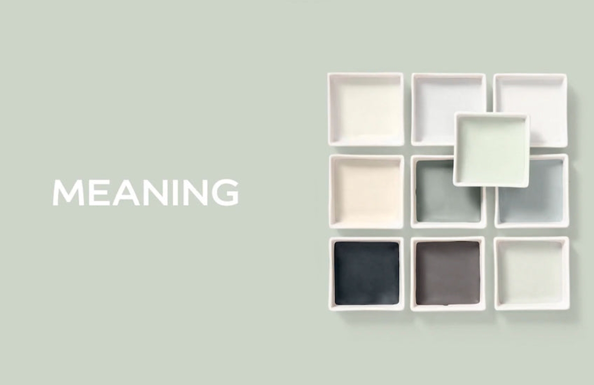
Image Credit: Dulux
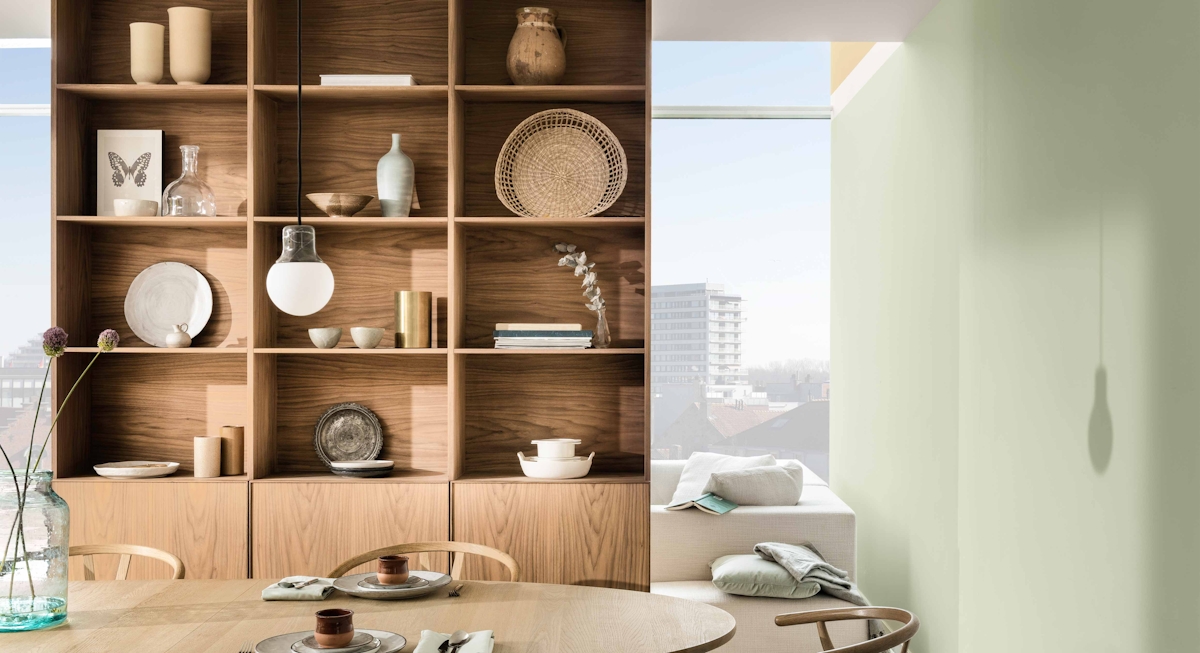
A Home For Meaning
The Meaningful palette is inspired by a tranquil winter dawn and pairs the Colour of the Year with both lighter hues of icy green and warm cream, and darker hues of deep charcoal and mole. It is designed to create a calm and contemplative environment. Using its lighter tones, this will suit a minimalist Scandi-inspired decor scheme; leaning heavily on its darker tones will make the colour palette even more modern.
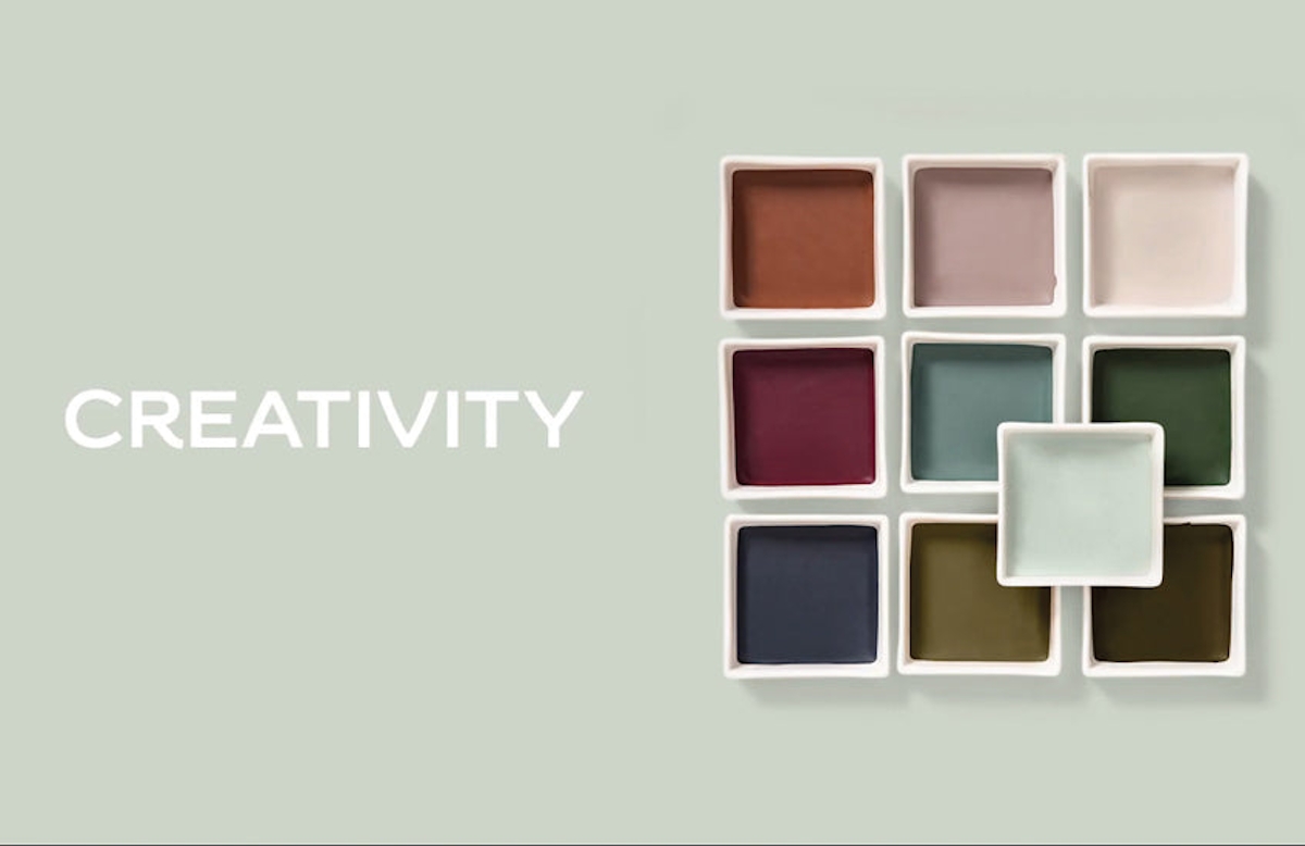
Image Credit: Dulux
A Home For Creativity
The Creative palette focuses on an autumnal dawn and understandably introduces burnt terracotta, rich mulberry and olive green into the mix. It is recognisable for its maturity, decadence and depth of colours which will empower the viewer to explore their creative side. Test out the Tranquil Dawn with some of the deeper tones for an exploration of the palette’s high contrasts.
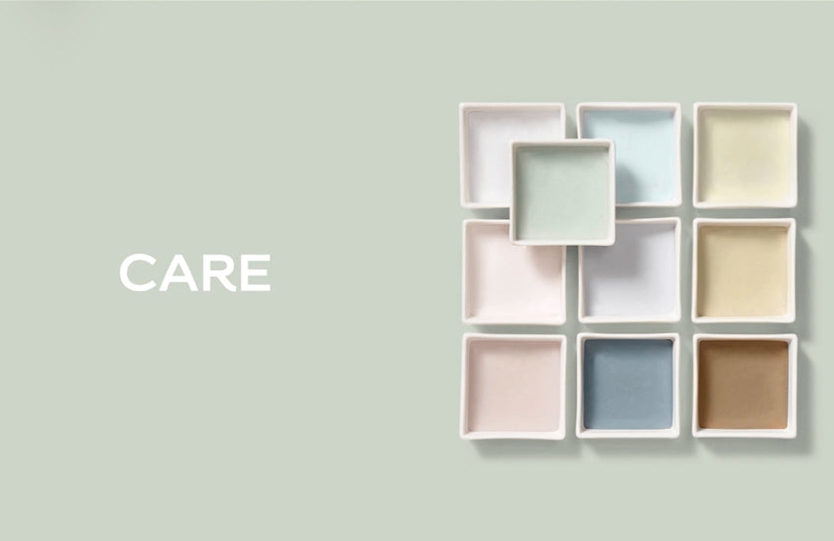
Image Credit: Dulux
A Home For Care
Perfect for nurseries and kids rooms, the Care palette features dusky rose pinks with muted denim and earthy neutrals. The palette—which is inspired by a spring sunrise—is reported to evoke “feelings of deep relaxation and peace”. Work it on an adult level by choosing two of the colours, using ultra-luxurious materials like marble and glass or using the palette in adjacent rooms with lots of neutrals to separate the key colours.
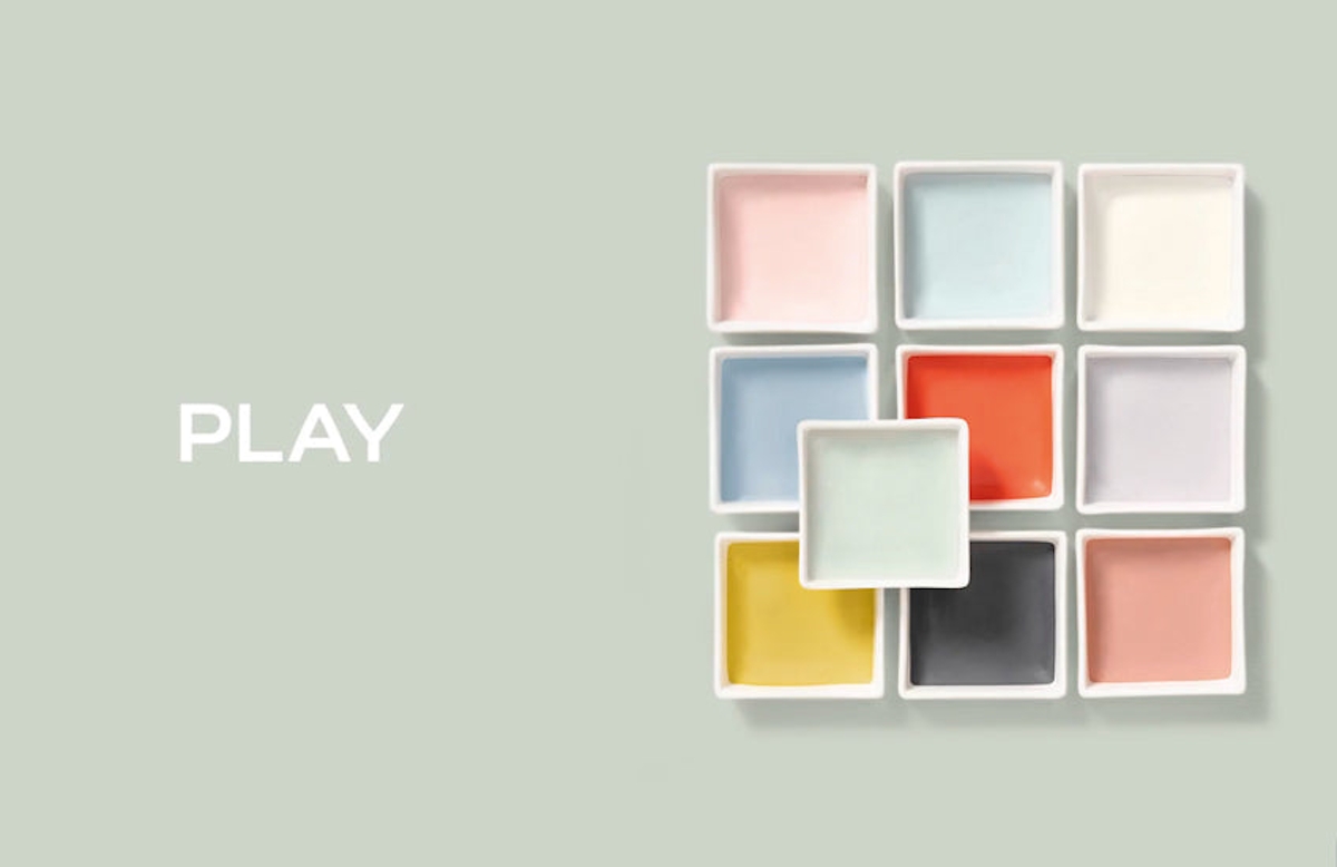
Image Credit: Dulux
A Home For Play
At first glance, this summer dawn-inspired palette might appear to be solely a child-friendly one but fortune favours the brave and the intrepid designer could ace this palette. Think goldenrod silk curtains, a vibrant modern art piece and subtle touches throughout the rest of the space with some dark cerused woods to ground the space.