After much consideration, 'Bright Skies’ has been selected as Dulux’s Colour of the Year 2022. The cool-toned pale blue mimics the feeling of “open skies and a breath of fresh air” and is capable of expanding even the smallest of spaces. What better choice could there have been than this hopeful shade for a fresh start in the new year?
0 items added to basket
Image currently unavailable
Price on enquiry
Subtotal (0 items)
£0.00
/products/WZ_TOB3655PBCL1631998445573.jpg)
Taking a step away from Dulux Colour of the Year 2021 ‘Brave Ground’ (a peaceful and unassuming grey-toned brown), Bright Skies is a refreshing and optimistic shade that brings with it the opportunity to rejuvenate. Arguably the blue counterpart to the ever popular ‘Tranquil Dawn’ (a peaceful and unassuming grey-toned brown), Bright Skies is a refreshing and optimistic shade that brings with it the opportunity to rejuvenate. Arguably the blue counterpart to the ever popular ‘Tranquil Dawn’(the colour expert's Colour of the Year 2020), Bright Skies promises longevity in its style—the paint brand proving over the years that using cool-toned variations of much-loved shades is the prevailing way to revitalise any home.
To accompany the Colour of the Year, Dulux has created four colour palettes to complement the shade and expertly bring it to life in any home. Each palette was designed with a different atmosphere in mind, ranging from creating spaces that are energising to serene, and ensures an easy home rejuvenation without any hassle.
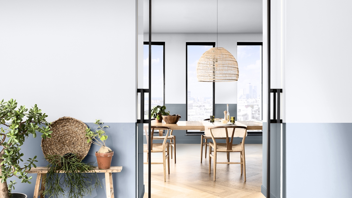
Image credit:
Workshop palette
A palette perfectly collated for an active space, where vibrant colours work together to form a creative and fun atmosphere, and one which is strong enough to keep up with the ever-changing functionality of your home whilst offering an unexpected twist. Use the palette as inspiration for your walls, or if you’re not feeling quite as brave, use it as a way to bring pops of colour into the space through accessories.
Greenhouse palette
Focussed on the idea of bringing the outside in. The cool blue of Blue Skies brings tones of the sky inside whilst the other shades mimic the natural shades of the sea. Paired beautifully with green it is best enhanced with green accessories or plants to bring the space to life. This palette works well in all homes, whether it acts as a complement to the greenery visible from the window or for a home in the city where it can provide a much needed injection of natural tones into the space.
/products/Greg_Natale_Wallpaper_Cushions_Orwell_Front1632027005259.jpg)
Studio palette
Soft and airy, the Studio palette is a collection of cool toned colours including a dusty rose and a muted grey to pair perfectly with the pale blue. Created for rooms where comfort is key, Dulux uses horizontal stripes to establish interest with the palette’s minimal shades. Playing with proportions can create a more dimensional space that has more depth to it.
Salon palette
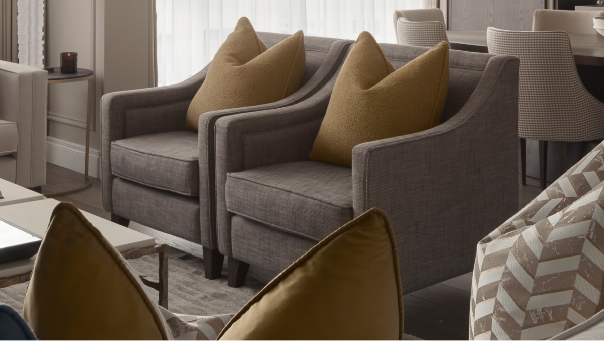
A neutral palette that lets the blue do the talking. The Salon palette creates a peaceful backdrop to everyday life that will complement any of your already-loved interior pieces. This combination is calming, versatile and without a doubt forms a sophisticated atmosphere. The lightest shade in the palette can be used to create neutral areas in a room so as not to compete with Bright Skies, whilst the warm brown grounds the space and provides depth.
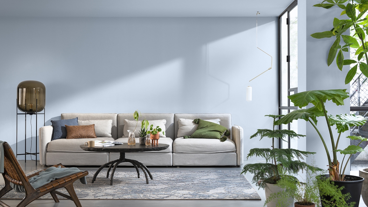
Image credit:
How to use the Dulux Colour of the Year in your Home
Initially the idea of a light blue room may seem an unexpected choice, one that could feel cold or unfriendly. In reality, if styled in the right way, blue can be used to create truly. Blue Skies has the potential to bring an optimism and openness to your home whilst creating the illusion of a much larger space.
On the ceiling
Dulux’s most unexpected suggestion: to paint only the ceiling. Perfect for those who want to inject some colour into a space without the possibility of overwhelming the walls. This trick lifts the space and raises the ceiling to lofty proportions. Due to its cool undertones, Bright Skies is said to provide the illusion of a far larger room because it makes any wall, surface or ceiling feel further away than it really is.
Marianne Shillingford, the creative director of Dulux praises its effects: “It just fills a room with a breath of fresh air. The ceiling is a great way to use it—the most fantastic use.”
In your bathroom
The best bathrooms are light, airy and have had every corner carefully considered for the ultimate relaxing experience. This can be challenging when they are so often in the smallest of spaces and, more often than not, lack much natural light. Bright Skies is the perfect choice for creating the impression of both a lighter and larger space within the bathroom. When accompanied with fresh white linens and gold accessories, it can create a fresh and luxurious feel.
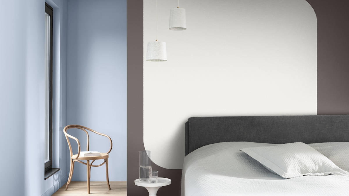
Image credit:
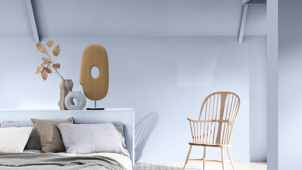
In your bedroom
A light blue bedroom pairs perfectly with soft earth-toned cushions and throws, allowing for a relaxing and peaceful escape. Wooden furniture subtly nods to the suggestion of bringing nature into the home whilst warming the coolness of Bright Skies to create a calming environment. Finish off the room with brass lighting accents and watch the light blue walls come to life.