Winter may be in full swing but that doesn't stop colour addicts and trend followers from looking ahead to spring and summer in wonder of what Pantone’s Colour of the Year for 2020 will be.
0 items added to basket
Image currently unavailable
Price on enquiry
Subtotal (0 items)
£0.00
WHAT IS THE PANTONE COLOUR OF THE YEAR FOR 2020?
Freshly announced and in pursuit of colour contender Dulux’s 2020 colour announcement, the colour aficionados at Pantone have revealed what its ruling hue will be for the next twelve months. Step aside Living Coral (Pantone’s Colour of the Year for 2019), and enter Classic Blue, 19-4052.
An unexpected choice, 2020’s Colour of the Year, as unveiled to the world on 4th December, was not a tone of green, plaster pink or even bold and bright red as the rumour mill circulated, but a ‘universal favourite’ called Classic Blue.
For the past few years, Pantone’s Colour of the Year has ebbed and flowed between soothing and awakening (keep on reading for a deeper explanation). While 2019 was a story of energy, 2020 lowers the tempo once more with a shade that “brings a sense of peace and tranquillity to the human spirit, offering refuge," says Pantone.
Image Credit: Studio Ashby—Floral Court; Photography by Philip Durrant; Styling by Olivia Gregory
Classic Blue extends itself also to any type of home, any gender and any aesthetic, offering the the ultimate in open-mindedness being both “genderless in outlook and seasonless in endurance” and also “emblematic of heritage but at the same time highly contemporary”—again, as proffered by Pantone.
It marks also Pantone’s first multi-sensory shade, having collaborated with experts in the field to create more than just a colour, but an experience, presenting Classic Blue as a sound, a smell, a taste and a feeling. At its launch event in Manhattan, a Classic Blue coined fragrance wafted through the air as guests reclined against Classic Blue textured cushions, sipping on Classic Blue cocktails.
HOW IS PANTONE’S COLOUR OF THE YEAR DECIDED?
Pantone is known for a number of things aside from its Colour of the Year accolade—a design direction for designers and brands chosen by its Colour Institute consulting service. That being said, the outputs from the Institute have come to be understood and consumed by individuals with a fascination and affinity with the effects of colour, as much as by industry brands.
Pantone’s also a provider of professional colour standards used by businesses across the globe, enabling them to show colours accurately and consistently through its colour coding systems. They’re effectively creators of colour.
/products/ck10_sw18_indig_6x8_099446351814_dt031632016659502.jpg)
But it’s the announcement of its Colour of the Year, its pedigree in both forecasting and defining colour trends, and deep sense of empathy between what’s happening in the world and the restorative impact that the colour of our homes and clothing can have on wellbeing, that’s earned them such widespread recognition.
And it's the latter that’s crucial to unpicking just how Pantone defines which colour or colours (history shows that Pantone very occasionally picks more than one shade, such as in 2016 when the powdered tones of Rose Quartz and Serenity were jointly selected as Colours of the Year).
Those on the Pantone panel—made up of designers, artists, journalists, architects and namely a collection of the world’s colour aficionados—seek to constantly be reflective of what’s happening in the world around us.
They’ll look beyond what feels seasonally relevant, concentrating more on how colour can depict social climate, how it can reflect upon it, dwell upon it, or even attempt to lift us out of it.
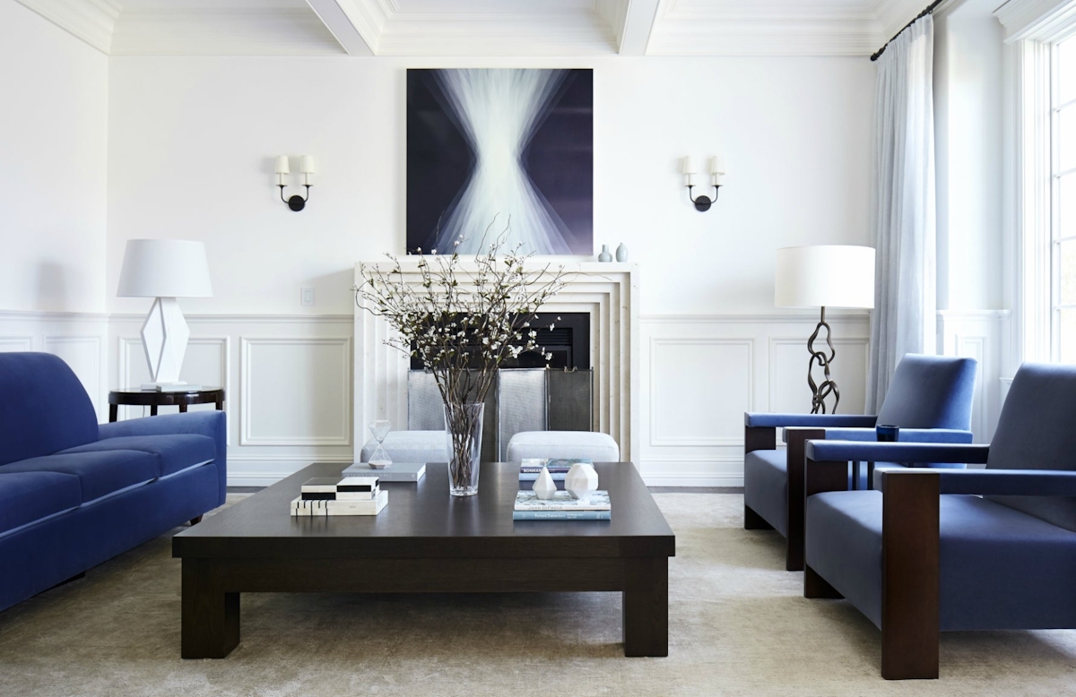
Image Credit: Heather Hilliard; Photography by John Merkl
The Colour of the Year 2017, Greenery, aspired to “provide us with the reassurance we yearn for amid a tumultuous social and political environment”—the words of Leatrice Eiseman, executive director of the Pantone Colour Institute.
The Colour of the Year 2018, Ultra Violet, sought to tease out feelings of creativity, spirituality and imagination in a world that’s constantly wired and sometimes suppressed.
The narrative for 2019’s Living Coral embodied that same mission, promising to energise and lift us out from an age dominated by digital technology and social media. Living Coral’s intentions were to contemplate intimacy, human interaction, warmth and connection.
And 2020’s Classic Blue, in Pantone’s words, is "a reassuring presence instilling calm, confidence and connection".
HOW TO USE CLASSIC BLUE IN YOUR HOME
One of the (many) character traits that makes Classic Blue a winner for home decor is its ease of use. This isn’t a blue that seeks to shock, to subvert or cause a stir. On the contrary, this reassuring mid-blue is a tranquil, timeless number, as Eiseman affirms.
“We are living in a time that requires trust and faith," she says, "It is this kind of constancy and confidence that is expressed by Pantone 19-4052 Classic Blue, a solid and dependable blue hue we can always rely on.”
So where to feature it in the home? Blues like this are linked not just to calmness of mind—befitting for the bedroom therefore—but clarity of thought. Take it then into home offices where it should accelerate paperwork and dreaded life admin. This could be a Classic Blue upholstered desk chair or simply a few desktop objects in a cerulean shade.
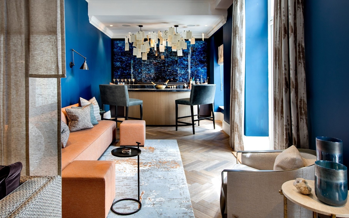
Image Credit: Helen Green Design
Yet, Classic Blue is also said to boost communication, so it could equally be a worthy contender for a new living room scheme, something that Eiseman also nodded to in her accompanying commentary for the big 2020 colour reveal.
"A boundless blue evocative of the vast and infinite evening sky," she explained, "Pantone 19-4052 Classic Blue encourages us to look beyond the obvious to expand our thinking; challenging us to think more deeply, increase our perspective and open the flow of communication.”
Whether you take it to your walls through expanses of Classic Blue paintwork or wallpaper, or scatter smaller accents via home accessories and lamp bases, it would seem that this is a colourway destined to succeed in every corner of the home.
Header Image: Helen Green Design