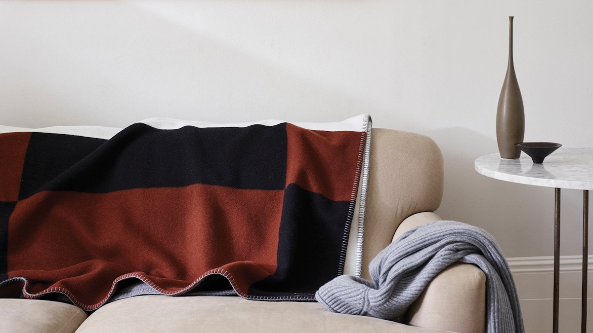
Emerald green, classic black, millennial pink. Struggling to pinpoint a colour scheme to run with for your next interior update? Take direction from these inspiring mood boards imagined by the some of the industry’s hottest interior design studios. From Mary McDonald’s ‘island luxe’ vibe to Elicyon's midnight blue scheme, discover six looks you’ll want to bring to life.
0 items added to basket
Image currently unavailable
Price on enquiry
Subtotal (0 items)
£0.00
Our Favourite Room Colour Palette Ideas Right Now
Six dreamy schemes to inspire your next update

By Joanne Quinn, Senior Interior Designer

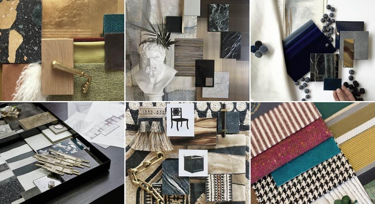
Image credit:
Elicyon
“This material palette was created for the formal reception of a penthouse project on the Upper East Side in New York," explains Elicyon Director Charu Gandhi. "We wanted a sophisticated high-contrast look, to go with the modern architectural details of the property, yet to suit the heritage of its location. We drew inspiration from some of the beautiful buildings on the neighbouring 5th Avenue, such as decorative Art Deco brass-screened doors and striking black and white marble floors.
The base of the material palette is dark emerald green and ivory with accents of brass, layered with semi-precious materials such as mother of pearl and shagreen leather. The texture of the samples varies from soft cashmeres and high-gloss piano lacquers to embossed leathers and brushed metals. Cabinetry will be clad in high-gloss figured sycamore veneer, with recessed brass trims and shagreen inlays. An emerald green eglomise mirror with gold-leaf patches is to be used to the back of the shelves in the bar unit. We always aim to design spaces that appeal to all senses with a mix of colours, textures and scents.”
Key elements: Emerald green and ivory hues, brass accents, mother of pearl, shagreen leather

Image credit:
Lawson Robb
“This scheme has been commissioned for a reception room in a bachelor-owned apartment in South Kensington London," tells co-founder Alix Lawson. "The client wanted a royal and timeless look – put simply he loves the deep midnight blues. The palette takes the richness and depth of midnight blue and marries it with the colour conformations of the humble blueberry, both of which we love at the studio at Lawson Robb.
We are using a spectrum that ranges from the richest deep blue to a greyish hue, set against warm, slick white walls. We are incorporating deep textures on furniture, upholstery and flooring. Precious stones combine with tiger eye, cracked lacquer and dappled shagreen. Within this is a hint of brass and white ivories, creating a very lush effect.
We are working with tiger eye on the coffee table, shagreen on the cupboard doors and credenzas, fresh white ivory curtains with a hint of gold threading. Cotton velvets are used on sofas, ottomans, benches and lounge seats. The rug will be an artwork of indigo and petrols.
It is a classic and exciting combination, offering a contrast between the fresh and dramatic. The touch is very textural and toothy; you can really sink into this combination both visually and corporeally.”
Key elements: Midnight blue and ivory tones, tiger eye, precious stones, cracked lacquer, shagreen

Image credit:
Jean-Louis Deniot
"This palette is a mix of different elements from the Nolinski Paris, the first Parisian hotel from the EVOK Group, who wanted to create a breathtaking, characterful and sophisticated haven, says Parisian designer Jean-Louis Deniot."
"For the reception and communal areas, the inspiration was the Opéra Garnier and the Comédie Française. I set out to create a contemporary version of theatre décor, so the guests feel on a stage. Dark surfaces were chosen to immerse the visitor instantly in an atmosphere that remains rigorously the same both day and night: a Parisian sky at dust time, with tones of greys, blues, and greens, as atmospheric as [it is] rich and moody.
We used mostly shiny finishes such as bronze and high-gloss panels, and lots of artist custom-painted finishes. We displayed those finishes in order to create an element of surprise – creating something unconventional, never seen before.
With the theatrical in mind, all materials were selected to captivate the audience’s curiosity. In the guest rooms, we used traditional French panelling as an accent. We replaced wall-to-wall carpet or wood floor with cement slabs, topped off with a shaggy rug which carries a herringbone pattern. The bathrooms were cladded with crackled tiling, referencing typical Parisian bathrooms of the early 20th century. The grand salon has a custom rug made with over forty colours and an abstract-painted wall referring to French 17th century panoramic scenes. There are so many special elements the guest can discover."
Key elements: Grey and blues tones, dark surfaces, luxe metallic finishes, traditional French details
Mary McDonald
"For a project in the Bahamas we are inspired by the natural hues found in various textiles woven from natural elements such as reeds, grasses and raffia, as modelled by our board.
The room is a rather open, airy sunroom leading off to a patio. We wanted to commit to island flair with a tribal tension element, conveyed by our black stone floor, ebonized wenge and gold drawer handle, and the Patterson Flynn & Martin abaca rug I designed. The authentic raffia and beaded Schumacher trims with the striped and plain linen fringes all read like palms and natural finds that are handmade from your own island, which is the vibe we were going for, but not to forget the glam element of a doré bronze chandelier chair and classical chairs. This scheme is the ultimate in Island Luxe."
Key elements: Raffia, black stone, ebonized wenge, bronze accents

Image credit:
Neal Beckstedt
"I am beyond excited to share a material board of a current project underway. This board is for the main living and dining room of a large modern apartment in Chelsea straddling the Highline," says New-York based designer Neal Beckstedt. The client didn’t want a neutral space, so we really went for it and brought in a lot of colour. Teal, mustard, sherbet orange, and lime greens will be offset with punches of black and gold leaf – and this is only the living and dining room! It will definitely be the most colourful apartment that I have designed and it’s an incredible experience expanding out of your comfort zone. The colour is not only in the upholstered pieces but will also be used on the walls, coloured stone tables, as well as the rugs - all playing off the client’s existing colourful art as well. In addition to the colour contrasts, the other finishes in the space have wide contrasts, providing a very layered home. For instance, the subtly patterned gold leaf that will be on a full height cabinet, hiding the television, is offset by the knotty raw floor. Pitted metal panels for the dining room bar shelves will be offset with a high-gloss sherbet cabinet. Refined traditional brass door hardware is offset with modern, minimal pitted steel. This mix of high and low adds depth and timelessness to a home.
Key elements: Teal, mustard, sherbert orange, stone, textured upholstery, gold leaf details

Image credit:
Natalia Miyar
"This palette was chosen specifically for a young client who lives in a beautiful house in Notting Hill. Her interior style tends to be quite serious so she asked me to come up with an unexpected selection of vibrant colours to create a lively reception room. The result is a retreat which is also glamorous enough for entertaining," Natalia Miyar explains.
"I am always inspired by vibrant colours found in nature, which tend to be more contrasting, unexpected colour combinations. The combination of textures and different materials works well and is anchored by graphic prints and woollen tweed. The bright colours, featuring aquamarine, emerald green, jade and hot pink, bring the palette to life.
I used the stripe on the curtains and the white timber with grey grain was made into a beautiful coffee table. We upholstered an armchair in the hot pink tweed and the turquoise leather on a footstool. The blue palm wallpaper added a feature to the back of the joinery. The scheme is appealing because it is fun and uplifting. The owner lives in different countries and wanted her London home to be an unexpected and dynamic space. She has multiple homes and this is her London pied-à-terre which she wanted to experiment with colour in."
Key elements: Vibrant greens and hot pinks, tweed, leather, graphic and palm prints