It’s here. The colour announcement we’ve all been waiting for—Pantone’s colour of the year. Following on from 2020’s Classic Blue and in a different direction to Dulux’s colour for 2021 that was announced earlier this year Brave Ground (which is all about warming, early neutrals), The Color Institute leads us into what hopes to be a brighter twelve months with two hues set to lift the spirits with Ultimate Grey and Illuminating.
0 items added to basket
Image currently unavailable
Price on enquiry
Subtotal (0 items)
£0.00
Pantone Colour of the Year 2021: Ultimate Grey & Illuminating
A pairing of cool and happy to revive our spirits

By Jon Sharpe, Chief Creative Officer
WHAT IS THE PANTONE COLOUR OF THE YEAR FOR 2021?
First, note that for 2021, there’s not just one colour of the year but two. (And, let’s face it, after this year, maybe we deserve two in 2021.)
Ultimate Grey is a warming mid-grey that Pantone describes as being practical and rock solid, whereas Illuminating is, more than anything else, an expression of positivity and joyfulness.
Together, the two provide a balm that on the one hand comforts, heals and reassures us all with a sense of the familiar and the safe, while on the other, lesser-used yellow rejuvenates and draws us out of our shells.
One without the other still makes sense, but they’re stronger when paired.
HOW IS PANTONE’S COLOUR OF THE YEAR DECIDED?
With much, much research. Less a quick proclamation of two colours set to trend for the next twelve months and more an in-depth study with a resulting colour thesis that pulls together findings from analysts, colour experts and trend forecasters from across the globe.
Those on the Pantone panel—including designers, artists, journalists and architects to name a few—seek to constantly be reflective of what’s happening in the world around us. They’ll look beyond what feels seasonally relevant, concentrating more on how colour can depict social climate, how it can reflect upon it, dwell upon it, or even attempt to lift us out of it.
“A large part of what we do is involved with the psychology of colour and how it plays into how people feel in general,” says Leatrice Eiseman, executive director of the Pantone Color Institute. “Usually our team is travelling all over the world, sharing ideas with each other—imagery, buzzwords—whatever we pick up on that we feel is important.”
“We will ask what is happening in socio-economic terms in the world to make sure that we pay attention to what the public at large is telling us, what their needs are, what their hopes are. With that information gathering, we can do our homework and come up with an intelligent analysis that enables us to decide on the colour.”
Perhaps more this year than for any year before, defining the colours for 2021 required an even deeper level of sensitivity. Little did anybody know that back in December 2019 when demure Classic Blue was announced, a pandemic was on the horizon. Though Classic Blue was chosen to provide, in Pantone’s words, "a reassuring presence instilling calm, confidence and connection”, would its panel have chosen the same hue had they had a crystal ball? We waited then for 2021’s colour with bated breath, eager to learn where on the spectrum Pantone would point its ruling finger at a colour response to COVID-19.
With one fingertip on the greyscale and another at the sunny segment of the colour wheel, the industry was not necessarily surprised at its announcement of a colour duo for 2021. Could one single colour ever be sensitive enough to react to what 2020 brought us? It’s not the first time its panel has proclaimed two colours of the year. Remember Rose Quartz and Serenity in 2016? If ever there was a time to double up, it’s now.
Laurie Pressman, vice president of the Pantone Color Institute adds: “It became apparent that there was never going to be one colour that could express everything that needed to be expressed—that it was, instead, critical to have two independent colours that could come together. Not only to subliminally convey the message that we can't do this alone—that we all need each other—but because it is the combination of the qualities of these colours that tells the story.”
HOW TO USE Ultimate Grey and Illuminating IN YOUR HOME
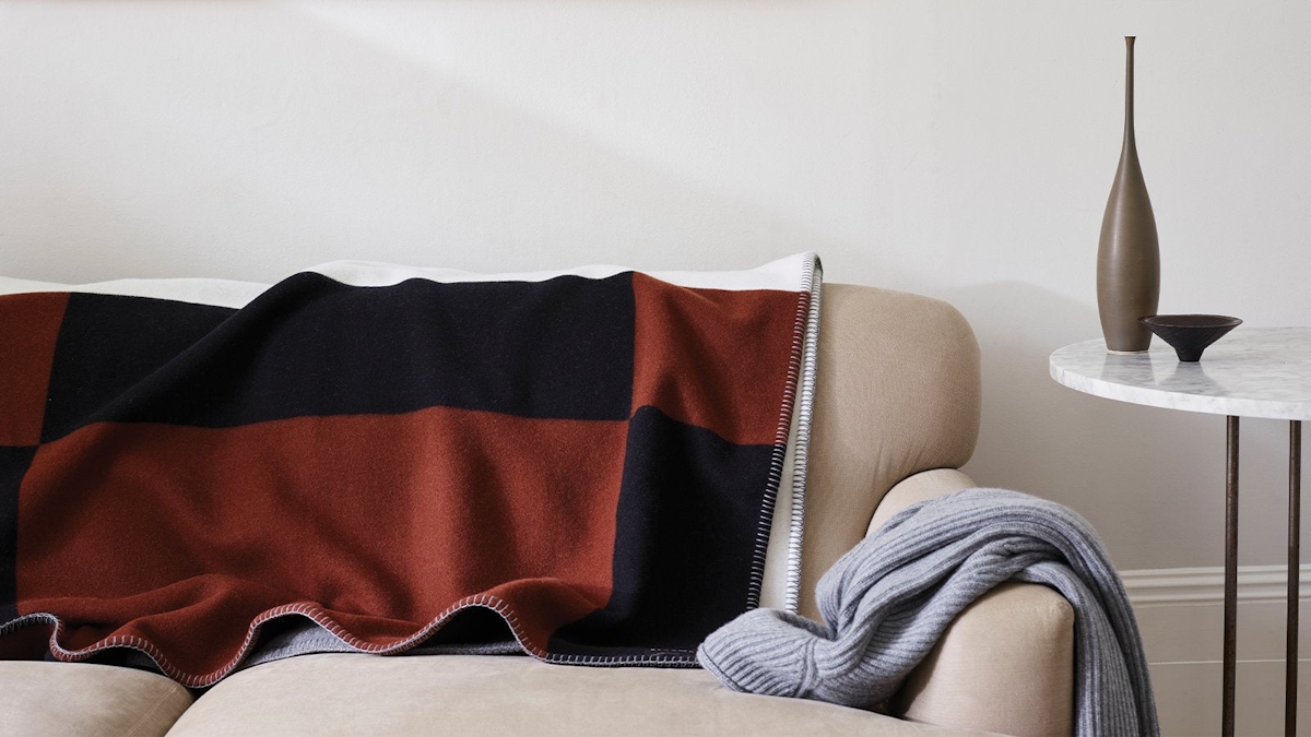
The world of interiors is far from over its love affair with grey; it’s a relationship that will last the course. And with Ultimate Grey, as the name suggests, you find yourself decorating with a version that’s understatedly warm, whether taking the form of grey carpet or an entire grey living room scheme.
Eiseman explains, “If we think of it in terms of nature, it’s the colour of pebbles at the beach, of rock and stone that have been around for millions of years and aren't going to disappear anytime soon. Grey denotes fortitude; something that you can hang on to that is always going to be there for you.”
From that grey bedroom idea you’ve been mulling over to a sofa strewn with grey cushions, this first of Pantone’s two colours for 2021 works, no matter the room, the scale or the surface.
Illuminating at first appears a little harder to use in interior design. Yellow, mood-boosting as it is, never feels as straightforward to apply compared to blues, pinks and even greens.
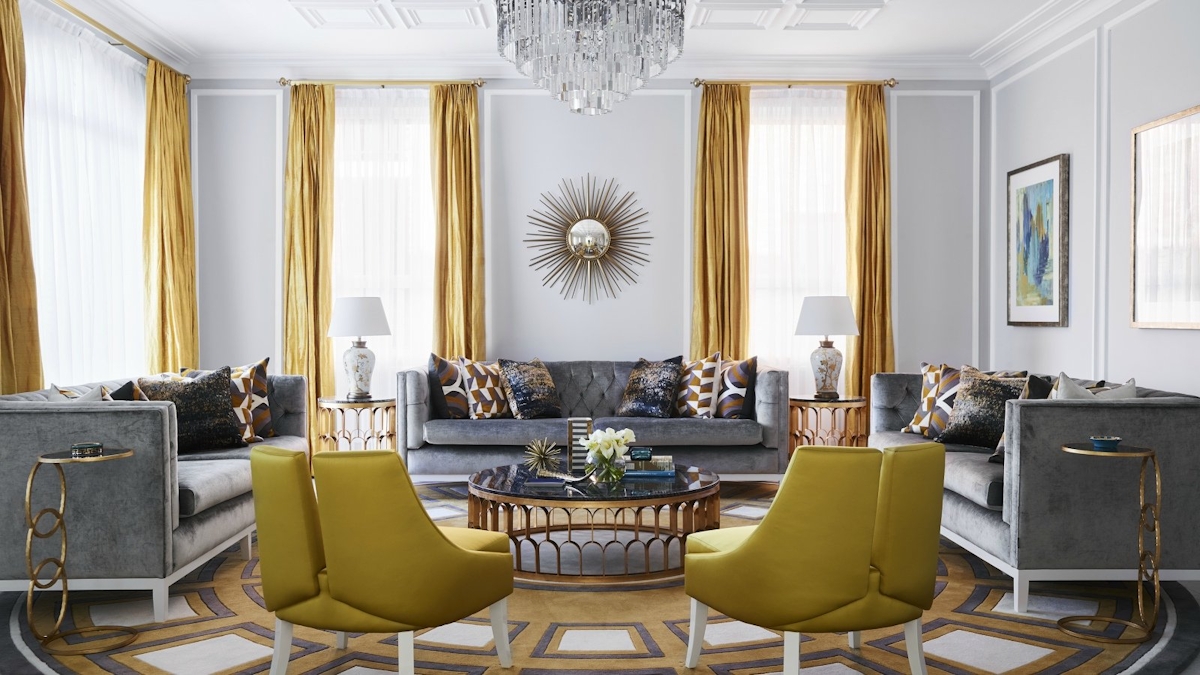
Unless you’re confident with the colour, use it as Pantone intended, in combination, to give rise to a Mid-century-inspired grey and mustard living room (though admittedly Illuminating is far lighter and sunnier than ochre-like mustard) or a refreshing grey and yellow bedroom.
If you want Illuminating to be the star of the show, pick out a key piece of furniture like a yellow sofa or yellow armchair so that your Ultimate Grey-toned walls sit back in the scheme.
Otherwise, ease yourself into a mellow yellow mindset with accents of Illuminating via yellow cushions or a yellow rug—overlap it with another rug if you still find the pop of yellow too strong.
And the most understated route of all to get creative with Pantone’s two colours for 2021? Reserve their use to carefully curated grey wall art and yellow wall art. In an otherwise neutral scheme of biscuit beiges (inspired by Dulux’s Colour of the Year perhaps) and monochrome, a wall filled with pieces in grey and yellow will work the trend without overtaking the rest of the room's colour scheme.
So, Pantone, you might make us wait until the end of the year for your Colour of the Year announcement, but with two to get us through 2021, we’re willing to forgive you.
Header Image: Greg Natale