Hot on the heels of Dulux’s Colour of the Year, Pantone’s Colour of the Year 2019 has been signed, sealed and delivered to the world’s media. But what exactly is Pantone, why is it that the interiors and fashion industries await its Colour of the Year with baited breath, how is it decided and defined, and how can you go about applying 2019’s alluring hue in your own home’s colour palette?
0 items added to basket
Image currently unavailable
Price on enquiry
Subtotal (0 items)
£0.00
Pantone Colour of the Year 2019: Living Coral
Step aside Living Coral. Freshly announced, Pantone’s Colour of the Year for 2020—the ruling hue—for the next twelve months is Classic Blue.

By Jade Bloomfield, Editor

Image credit:
What is the Pantone Colour of the Year for 2019?
Living Coral. The names that Pantone’s Colour Institute chooses for its colours are often highly creative, and at first seem abstract and, yes, even whimsical. But, once the story and the vision behind each of its hues is revealed, the naming conventions begin to gain real clarity and meaning.
For 2019, its punchy, fresh, energising and uplifting choice of Living Coral presents us with precisely what we hope for and envisage when we imagine coral – orange with an undertone of warm pink – but with an enriching golden aura that is both comforting and nourishing. Feelings that the specialists at Pantone deem will be appreciated in a time of economic ups, downs and never-ending change. Living Coral will fill our homes with buoyancy.

Image credit:
How is Pantone’s Colour of the Year decided?
Pantone is known for a number of things aside from its Colour of the Year accolade – a design direction for designers and brands chosen by its Colour Institute consulting service. Though the outputs from the Institute have come to be understood and consumed by individuals with a fascination and affinity with the effects of colour, as much as by industry brands. Pantone’s also a provider of professional colour standards used by businesses across the globe, enabling them to show colours accurately and consistently through its colour coding systems. They’re effectively creators of colour.
But it’s the announcement of its Colour of the Year, its pedigree in both forecasting and defining colour trends, and deep sense of empathy between what’s happening in the world and the restorative impact that the colour of our homes and clothing can have on wellbeing, that’s earned them such widespread recognition. And it is this latter remark that’s crucial to unpicking just how Pantone defines which colour or colours (history shows that Pantone very occasionally picks more than one shade, such as in 2016 when the powdered tones of Rose Quartz and Serenity were jointly selected as Colours of the Year).

Image credit:
Those on the Pantone panel – made up of designers, artists, journalists, architects and namely a collection of the world’s colour aficionados – seek to constantly be reflective of what’s happening in the world around us. They’ll look beyond what feels seasonally relevant, concentrating more on how colour can depict social climate, how it can reflect upon it, dwell upon it, or even attempt to lift us out of it. The Colour of the Year 2018, Ultra Violet, sought to tease out feelings of creativity, spirituality and imagination in a world that’s constantly wired and sometimes suppressed. The Colour of the Year 2017, Greenery, aspired to, in the words of Leatrice Eiseman, executive director of the Pantone Colour Institute, “provide us with the reassurance we yearn for amid a tumultuous social and political environment”. The narrative for 2019’s Living Coral embodies that same mission.
The narrative behind Living Coral and the rationale for selecting it as the 2019 Colour of the Year, is that it will energise and lift us out from an age dominated by digital technology and social media. Living Coral’s intentions are to contemplate intimacy, human interaction, warmth and connection. “With consumers craving human interaction and social connection, the humanizing and heartening qualities displayed by the convivial Pantone Living Coral hit a responsive chord,” explains Eiseman.

Image credit:
How to use Living Coral in your Home
So how to make the most of the 2019 Pantone Colour of the Year in your home’s interior?
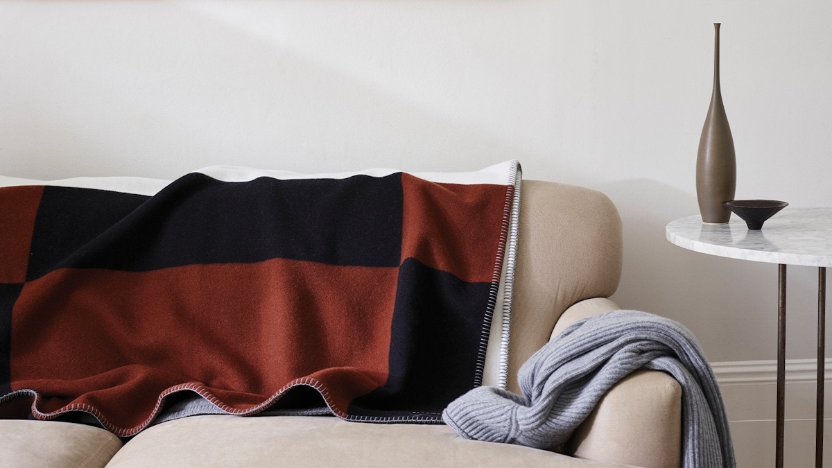
Laurie Pressman, Vice President of the Pantone Colour Institute, sets out various different scenarios in day-to-day life where Living Coral can play an important role, from fashion, beauty and product design to our interior decor and furnishings. Pantone’s guidance is that using Living Coral will provide an immersive experience in the home, enveloping your room in colour with its ever-present playful spirit. For subtler pops of colour however, Pressman suggests: “As a colour linked to tactility and human connection, Pantone Living Coral in shag rugs, cosy blankets and lush upholsteries create a warm, comforting and nurturing feeling in the home. With its ebullient nature, Pantone Living Coral adds a dramatic pop of colour to any room setting whether in decorative accessories, tabletop, or on the wall.”
Like with any shade on the spectrum, Living Coral can be used in a large-scale way – the predominant colour in your palette. Or, as an accent – one that won’t blend into the background but will sing out richly and warmly. And despite being so punchy, it’s remarkably easy to blend with most colours because it will mostly bring about contrast, whether it’s against dark grey and blue or soothing neutrals. Try Living Coral with dreamy pastels and it gives them some edge and prevents your scheme from feeling sugary. Couple it with mid-blues or purple-based blues and the dichotomy is almost contemporary Mediterranean – a rush of joyous colour that boosts your mood and feels rather brave. Or if your palette direction is one of similar orange hues, Living Coral represents another interpretation of the colour you love, helping your scheme to be multi-layered, textured and admiringly confident.